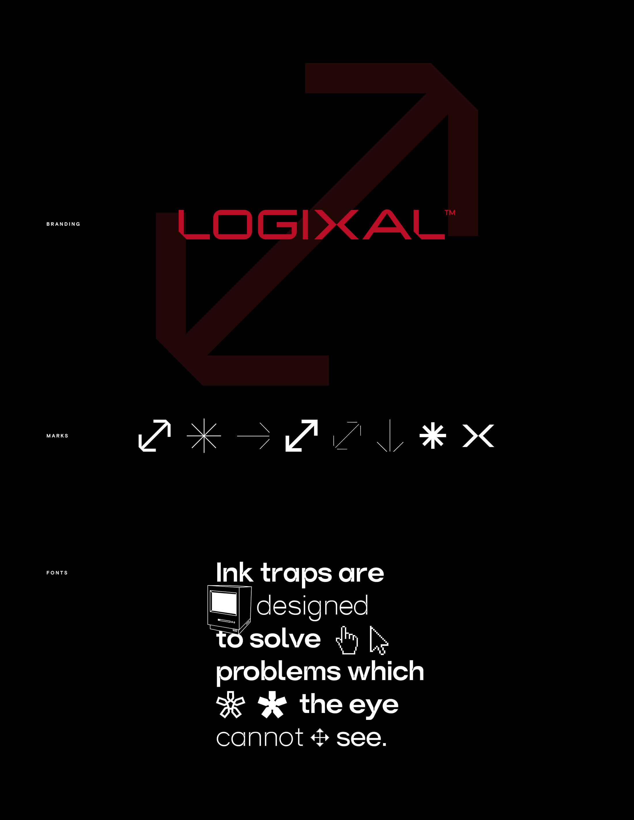
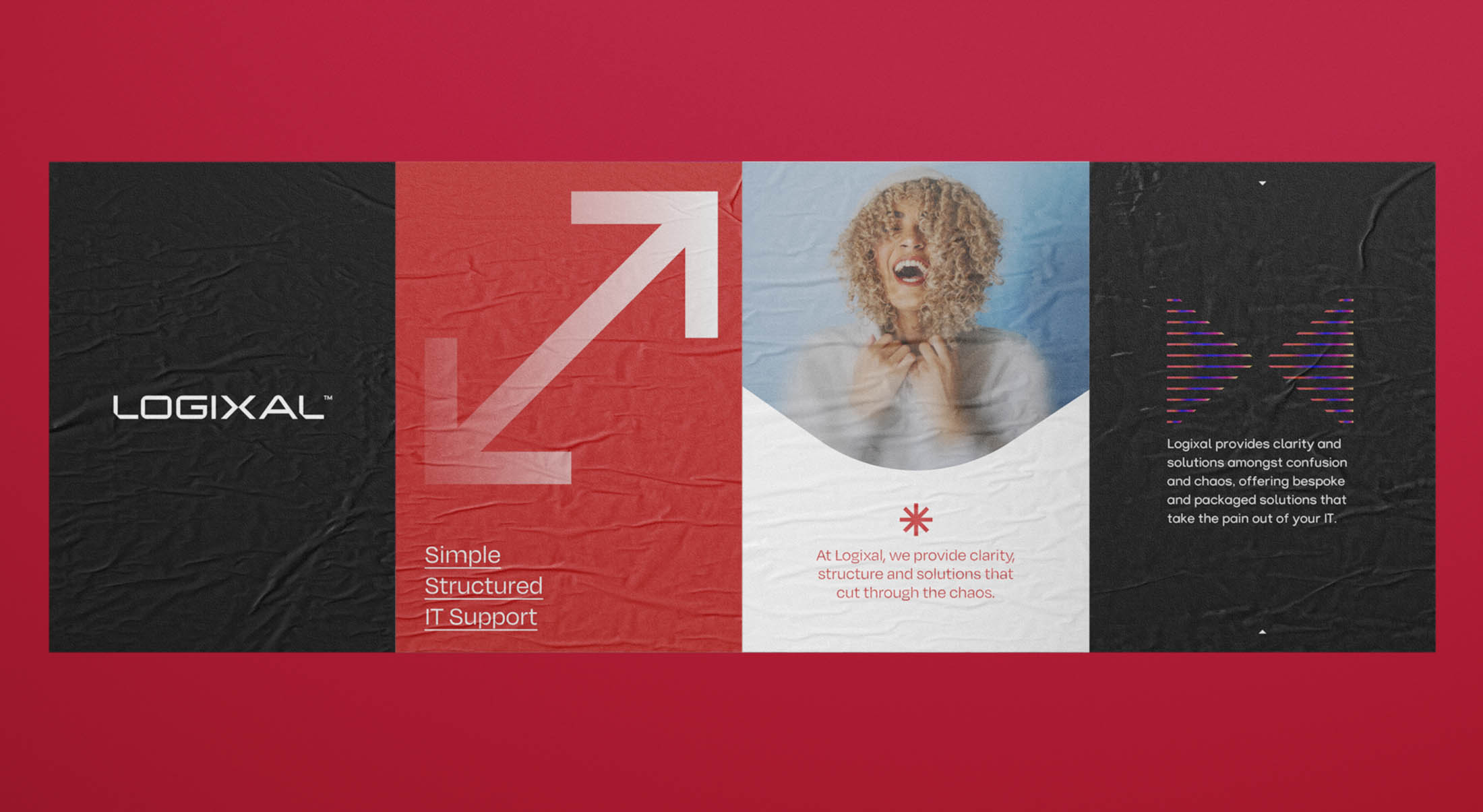
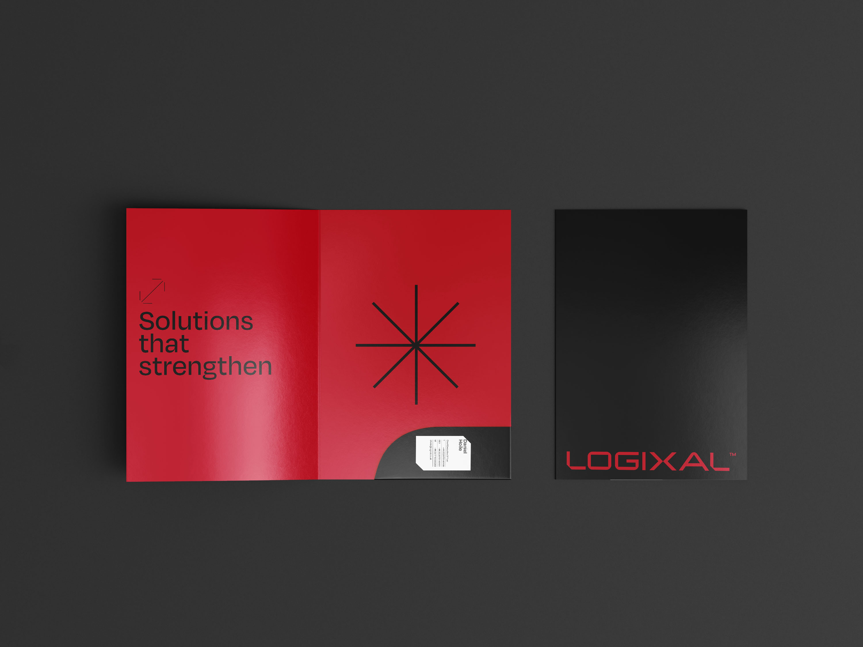
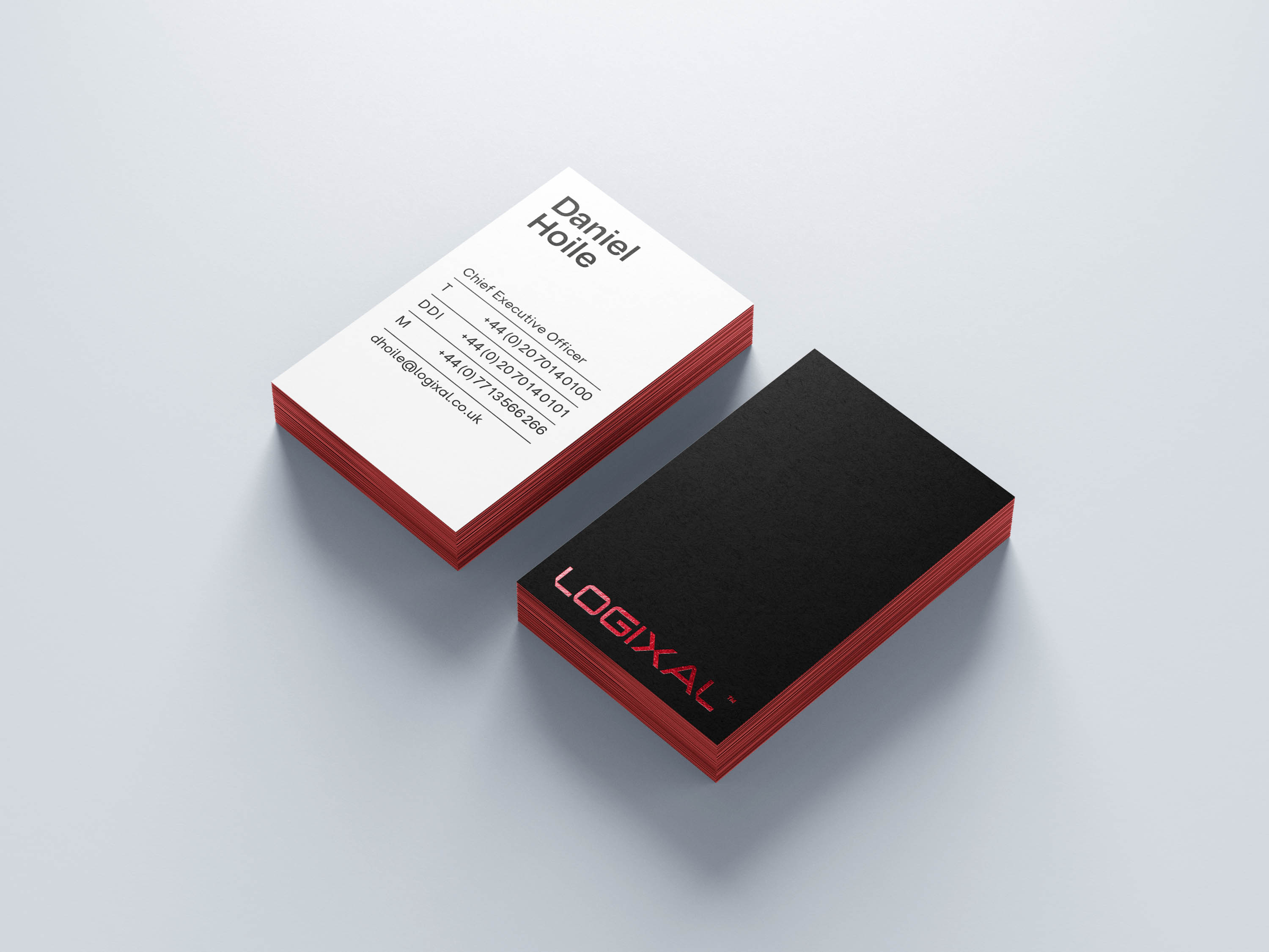
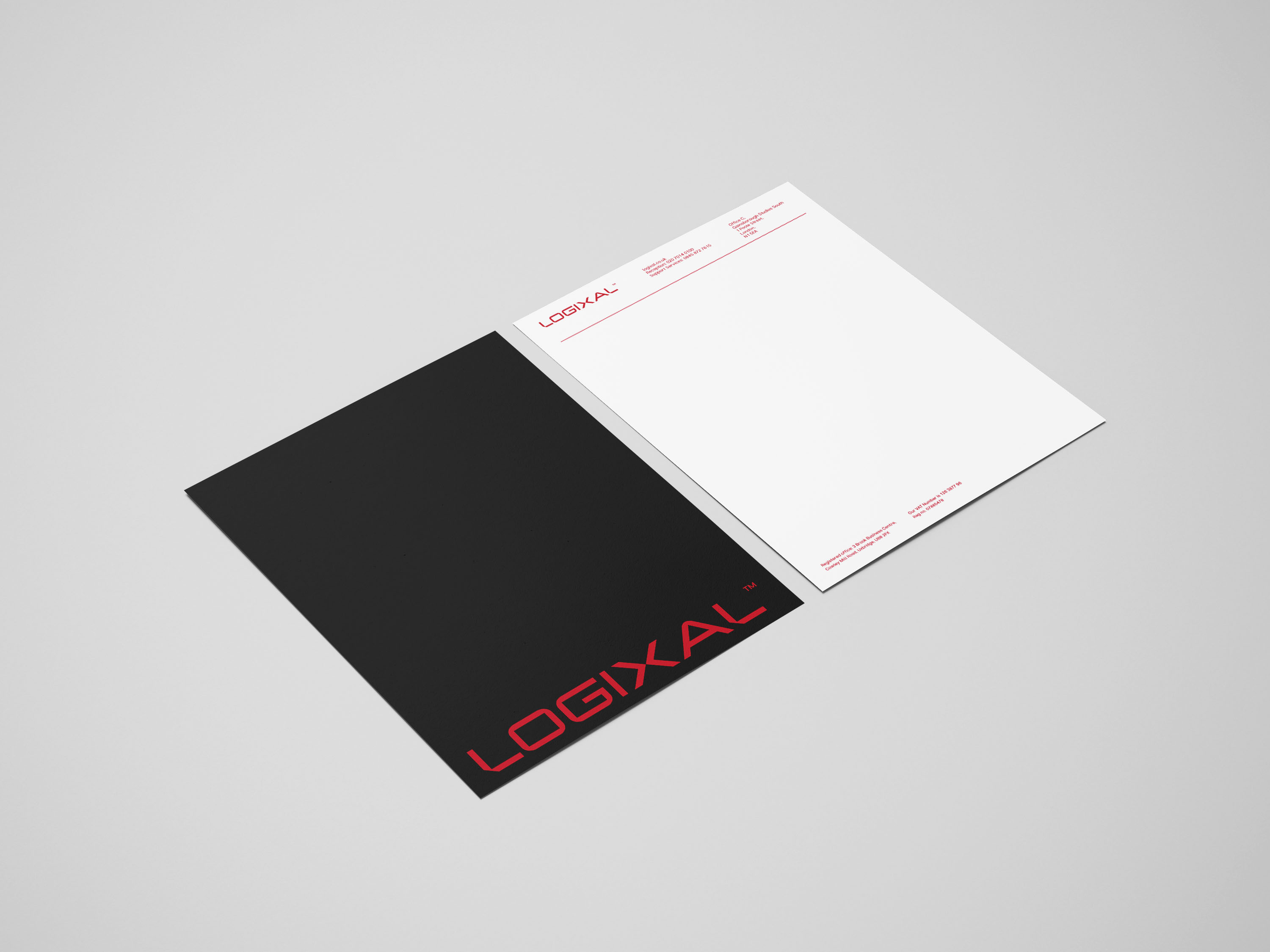
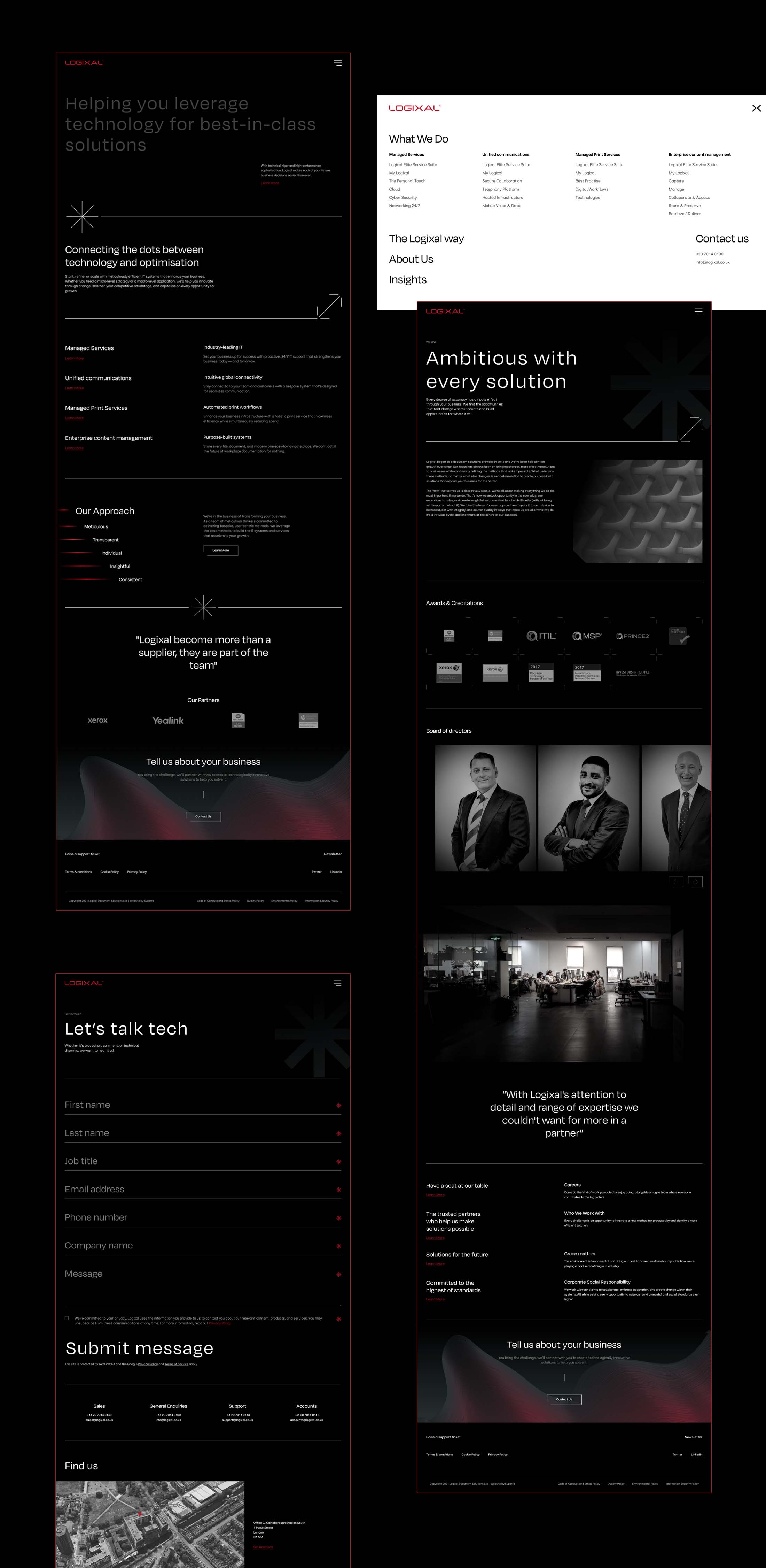
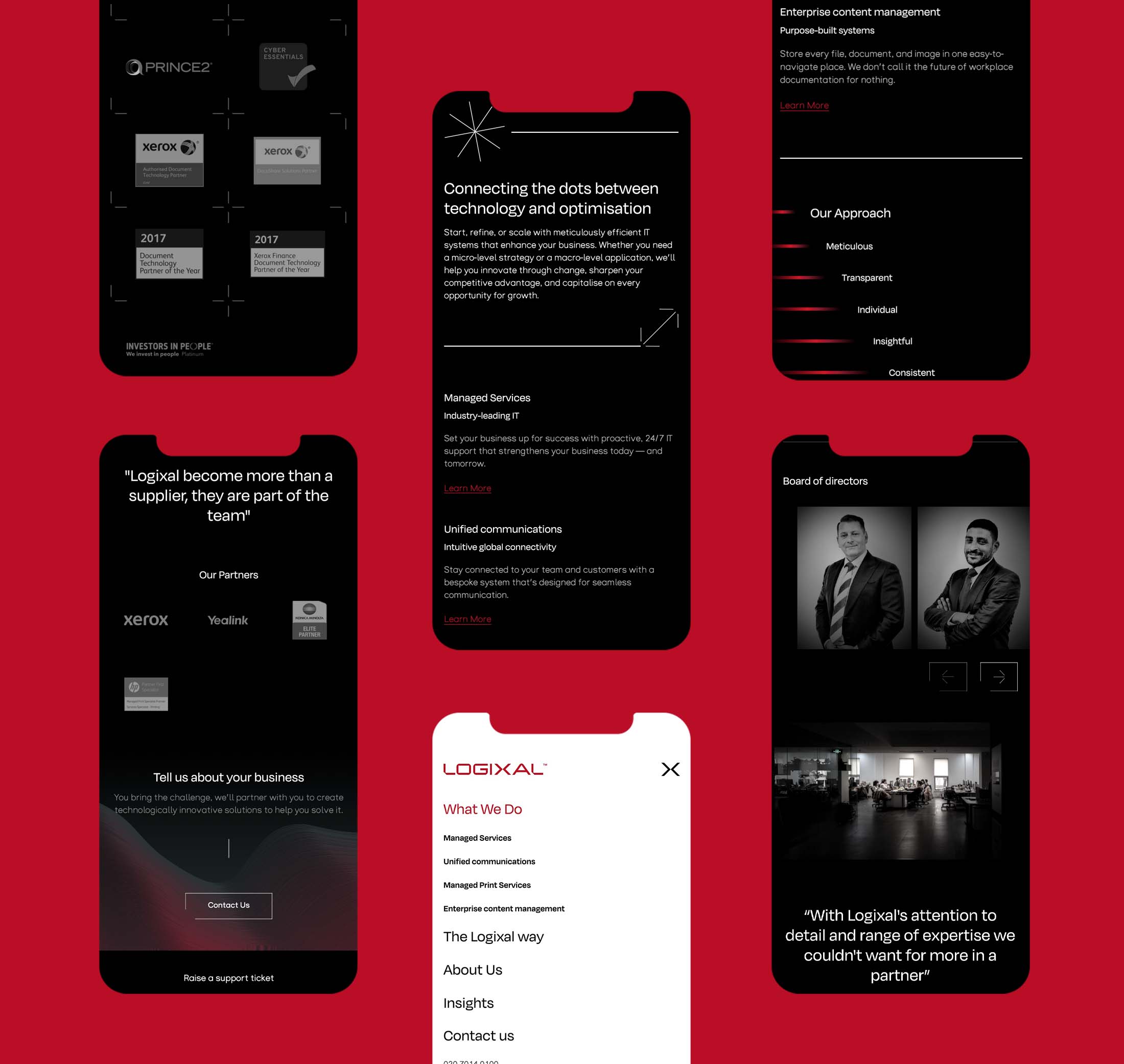
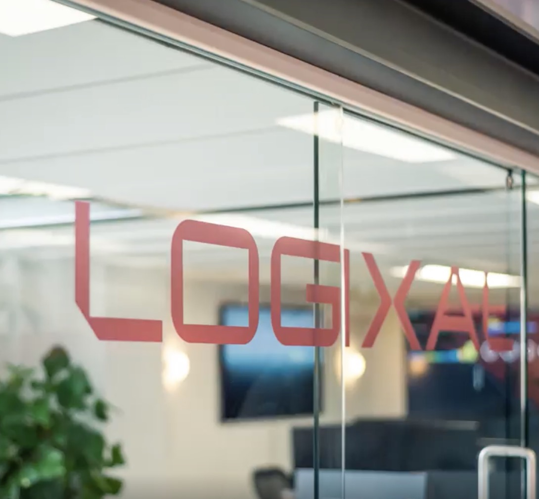
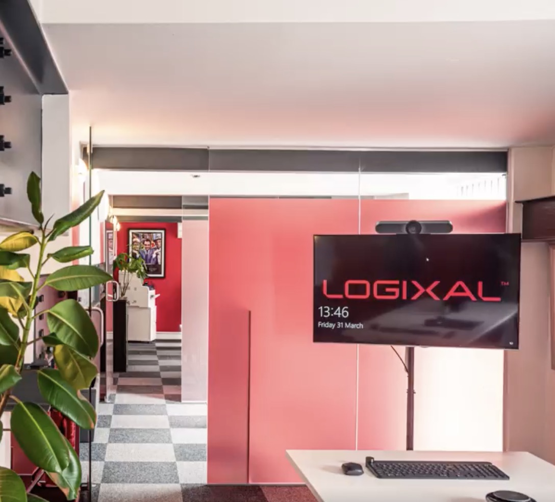
A Knight Rider inspired, super hi-tech minimal and contemporary ID, standing head and shoulders above their competition and forming a new standard in the IT industry. The ID consists of very simple forms and colours, taking cues simple things like a flashing red LED on a server, to specialist fonts designed for printed material and coding symbols. No expense was spared on the digital or print aspects of the project, if it was going to be done, it was going to be done right. Triple layer embossed and metallic foiled cards, letterheads and folder packs for a start, and a completely custom built site from Superrb.
The relaunch was a massive 'look at us now' to everyone, and the business continues to grow exponentially. We like to think we had a little something to do with that.